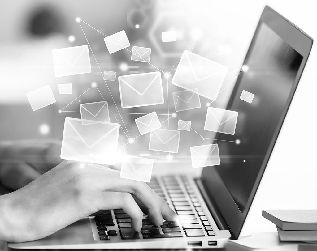
Email marketing is by far the most effective marketing outlet in our day and age, and for several reasons. Email marketing is the most cost-effective way to send your marketing message to a large audience, and the best part is, most of this can be automated!
But how exactly does a good email come to be? Here are a few tips to get you headed in the right direction.
A flow
Sure, you may have this perfect vision for an email… but that doesn’t mean your vision is a good one or that it makes any sense. When someone receives your email, they must understand the content, and it must flow from beginning to end. For this to happen, you’ll need to take a step back and look at everything from the receiver’s point of view.
Do they already know what your product is? Do they know who you are? Have they already received emails from you? Did they open those emails? Is this a fairly new service or product you’re pushing or have you been pushing it for a quite a while now?
After you’ve figured out the answers to these types of questions, you can begin structuring your email. For example, if it’s a new group of prospects you’re marketing to and if it’s a new product you’re pushing, you’ll have to figure out how you want to explain who you are, what the product is, and why they should buy this product from you specifically – which is a lot for one email. This content must not looked forced, and it must flow throughout the length of the email – which can actually be quite difficult. At this point, you may need to consider breaking the email up and creating a multi-email marketing campaign instead.
Simple text
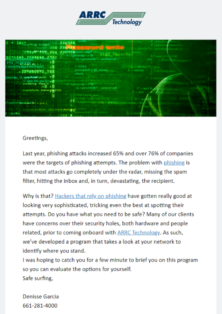
Just like your website and other miscellaneous marketing material, the text inside an email is not meant to ‘wow’ a reader, and it certainly isn’t there to show people how intelligent you are. You want people to understand what you’re saying, and you don’t want people to work too hard to pick up what you’re putting down.
Your email should be easy to read and understand. We’re talking like a 4th or 5th grade reading level here. Write at a level any higher than that and you better hope you’re talking to Einstein, because every other person out there will be annoyed and turned off.
A goal
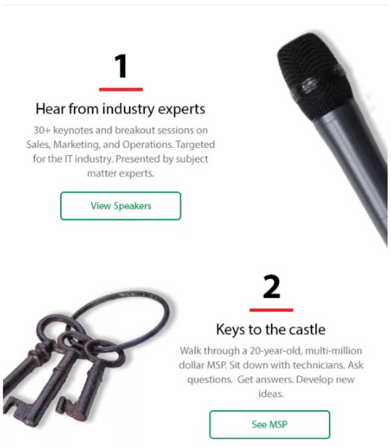
What’s your ultimate goal of an email? Is it to buy something? Call you? Click on a link? Register for something? Get to know you better?
Whatever your goal is, make sure you only have one and that it’s an obvious one. Because think about it, if you aren’t sure what the ultimate goal of your email should be, then you aren’t leading your readers anywhere – well, except to the delete button. Confusion will only send your readers running for the hills.

Scrolling vs. CTAs
Some emails can get pretty lengthy. It’s not that they have a ton of text inside them; it’s more that the photos can cause emails to be longer than normal. And unfortunately, this could work against you – even if you do have the most creative email ever invented.
If your call-to-action (CTA) is stuck all the way at the bottom of the email and the recipient has to scroll forever just to get to it, they may click off the email before they receive an opportunity to click on anything. At this point, you can do two things: make your email shorter or duplicate the CTA at the beginning of the email. If you decide to do this, you can make it look natural if it’s placed inside your header.
Good images
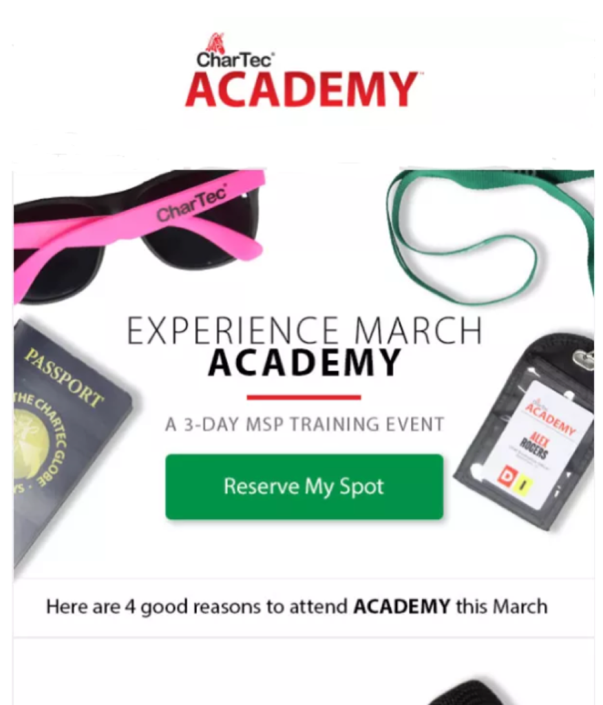
When you decide to branch out of the traditional text-based email, go for the gold and use some high-quality images. Something modern. Something impactful. Something that resonates with the theme of your email. And something people can relate to.
However, this does not mean you should slap a Shutterstock photo of a man sitting at a desk and call it good. Think outside the box and try not to be so literal. Just like your website, it’s about creating a positive and lasting impression. But keep in mind… good imagery doesn’t always involve images.

Short and sweet
It’s understandable. You love yourself. You love your business. You love your products and services. But unfortunately, not everyone loves those things as much as you do. Sorry…
This being said, an email does not need to go on forever. Keep it short and sweet and to the point. The easier it is to skim and understand, the better off you’ll be and the more your readers will appreciate it.
Leaking traffic
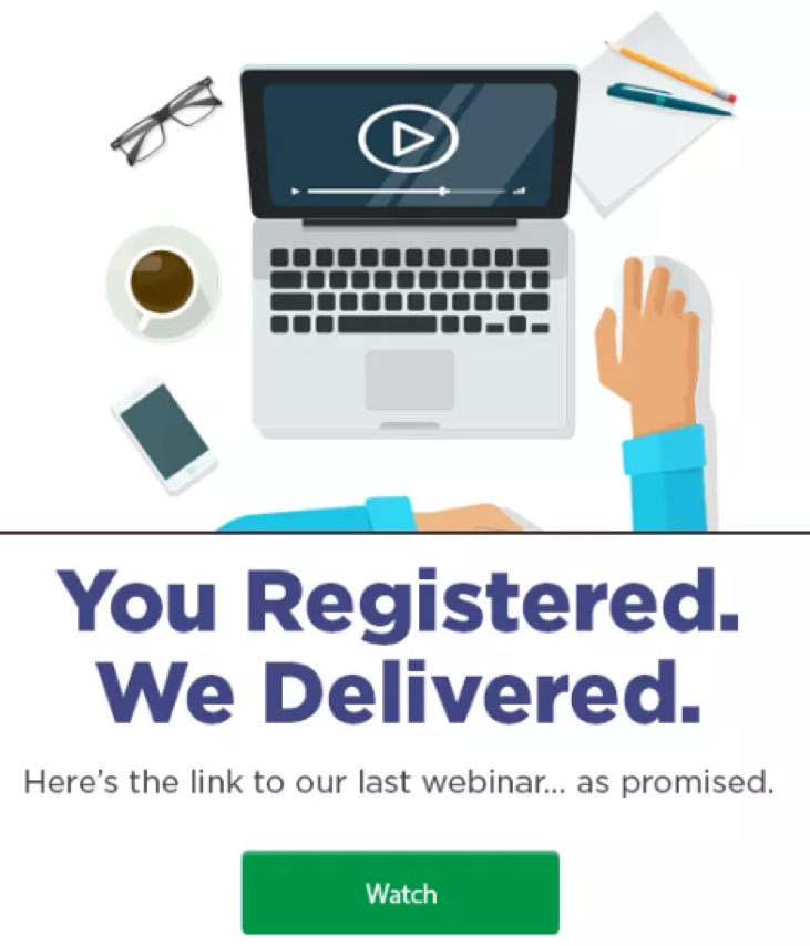
Links and buttons are great and all, but if you have too many, you risk the chance of leaking traffic. And this goes both for your email and any landing page a link from an email goes to. If there are too many options to click on within an email, you’re detracting from that ultimate goal we were talking about earlier.
Keep your CTAs, buttons, and links to a minimum. If you do need more than one button, it must be complimentary and something you just can’t send the email without – for example, you’re trying to register someone for an event but they may need to learn more about it before they can make a decision (so you’d have a Learn More and a Register button). When you need multiple CTAs like this, you can always make the button you prefer people to click on brighter, bigger, and bolder.
Other than that, you need to keep the distractions to a minimum.




Leave A Comment